
Are you planning to create a mobile optimized website? Which would be the better option – a standalone mobile website or a mobile responsive site?
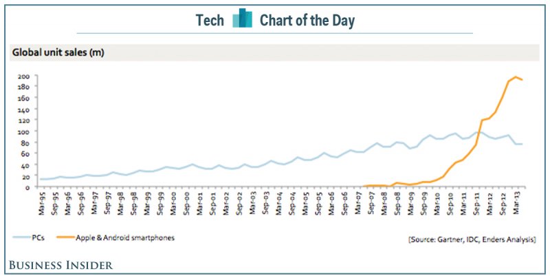
Smart phones alone beat out PC sales in 2011 and since then they have continued to grow rapidly. Even Matt Cutts of Google “wouldn’t be surprised” if mobile search exceeded desktop queries in 2014 itself. Nearly 80% of Facebook’s 1.28 billion active users, access the site via a mobile device. According to comScore, in June 2013, 55% of all time spent with online retail took place on a mobile device. If businesses want to take advantage of this burgeoning mobile traffic they need to possess a mobile optimized website.
What are the available options for creating a mobile optimized website?
Image Credit: Flickr Johnnydoes
There are two options available for creating a mobile optimized website. You can go about this by developing a standalone mobile website or a mobile responsive site.
Standalone Mobile Website
A standalone mobile website is a separate website. This is meant for your mobile users only and is different from the one for PCs. The website is placed on a separate domain or sub-domain and people visiting your regular website through a mobile device are redirected to the standalone mobile website.
The biggest problem with a standalone mobile website is that you need to create and maintain two separate websites. If you make changes to one you have to repeat the same changes on the other. This could cost more time and money. Also if you place it on a separate domain, you will need to spend money on both, a new domain and hosting.
The redirection can affect loading time which can increase bounce rate as visitors can be impatient.
Mobile Responsive Website
A mobile responsive website is one that adjusts its size depending on the type of device. People visiting the site from a PC or laptop will see the desktop version, whereas those visiting from a mobile device will view a mobile version. A code embedded within the website automatically helps it adjust itself for suitable viewing depending on the dimensions of the device.
A mobile responsive website is easier and cheaper to maintain as it is only one website. Any changes you make will be visible on both the mobile and web version.
An experienced designer can add a custom responsive code that will give your website the appearance you and your audience will like.
If your website runs on WordPress you can also opt for installing a mobile optimized theme offered by services like StudioPress and Elegant Themes. Those 2 are premium services.
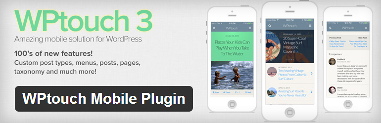
A WordPress website can also be mobile optimized with a free plugin like WP Touch.
If you have the choice between a theme, a plugin or a designer, always go for a designer as themes and plugins provide only one result. Also plugins might not always work like you had imagined.